Forecast
This report details the exploration of using modeltime for stock forecasting, which will be implemented as a sub-module for our Shiny Visual Analytics application
A Forecasting Workflow
Let’s first take a look at the standard process of producing forecasts for time series data and the common R packages which are used for each step of the workflow.
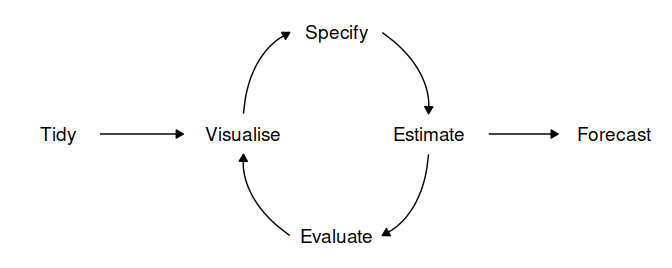
- Data preparation (tidy): Before any time series forecasting can be done, the core requirement that needs to be satisfied is getting historical data. After which the data must be prepared to get the correct format. Lucky for us, since the focus of our application is on stock analysis and forecasting, the retrieval of stock’s historical data can be easily done with the use of packges such as
tidyquantorquantmod. No pre-processing is needed as the data will already be in a cleaned format. - Plot the data (visualize): Once data are collected and processed, the next essential step in understanding the data is Visualization. By visually examining the data, we can spot common patterns and trends, which will in turn help us specify an appropriate model. This step of the workflow will be handled by the Explorer module of our Shiny application through the use the
timetkpackage. - Define a model (specify): There are many different time series models that can be used for forecasting. Choosing an appropriate model for the data is essential for producing appropriate forecasts. It is generally a good idea to try out and compare a few different models before specifying a certain model for forecasting. Traditional time series forecasting models such as ARIMA, Exponential smoothing state space model (ETS) and Time series linear model (TSLM) are available through the
forecastpackage, which has now been deprecated and replaced by thefablepackage. Machine learning models can deployed using thetidymodelsframework with its’ machine learning focused packages and toolkit. - Train the model (estimate): Models will have to be fitted into the time series before it can carry out any forecasting. The process usually involves one or more parameters which must be estimated using the known historical data. The parameters often differs between models and packages, requiring the forecaster to understand the syntax of each model to perform the modeling.
- Check model performance (evaluate): The performance of the model can only be properly evaluated after the data for the forecast period have become available. A number of methods have been developed to help in assessing the accuracy of forecasts.
- Produce forecasts (forecast): Once a model has been evaluated and selected as the best model with its parameters estimated, the model should then be refitted with the entire data being forecasted forward.
A Visual Analytics Application
The Visualize, Specify, Estimate and Evaluate steps form an iterative process which requires the forecaster to perform repeated cycles of calculated trial and error in order to achieve a good result. The Shiny Visual Analytics Application (VAA) will utilize graphs to explore the data, analyze the validity of the models fitted and present the forecasting results. By providing the user with an interface to tune and visualize models, the application will enable forecasters to easily experiment with different algorithms without the need to write codes and scripts.
Benefits of modeltime
- Integrate closely with the
tidyversecollection of packages, particularlymodeltimelets user taps into the machine learning ecosystem oftidymodelsthrough the use ofparsnipmodels. - Easy to create, combine and evaluate a plethora of forecasting models.
- Plots created by
modeltimeare either ggplot2 for non-interactive plots or plotly for interactive plots, making it easy to do additional configuration such as themes and legends.
Time series forecasting with Modeltime
Loading the packages
The packages below will be required. Additional tidymodels engines are also needed depending on the machine learning models to be used.
- tidyverse
- lubridate
- timetk
- modeltime
- tidymodels
packages <- c('tidyverse', 'lubridate', 'timetk', 'modeltime', 'tidymodels', 'tidyquant', 'glmnet', 'randomForest', 'earth')

for (p in packages){
  if (!require(p,character.only = T)){
    install.packages(p)
  }
  library(p,character.only = T)
}
Loading and preprocessing the data
One of the objective of the application is to make it stock-agnostic, meaning we can use the application with any stock and not just any specific symbol. For the purpose of this report, we will be using Apple’s stock (AAPL).
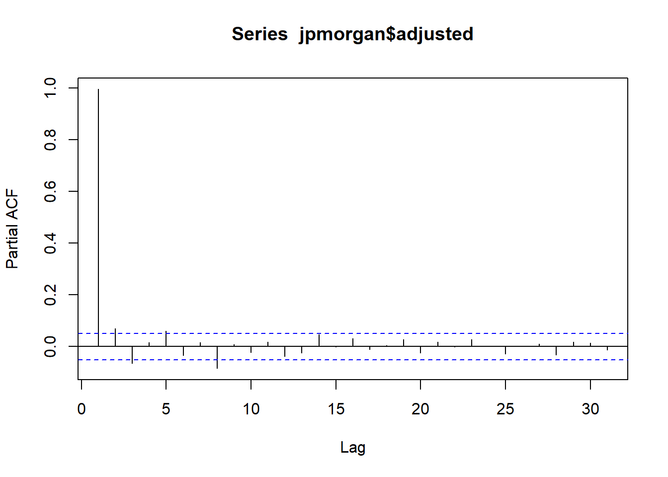
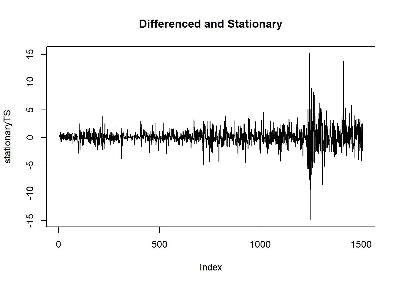
stock <- tq_get("AAPL", get = "stock.prices", from = " 2021-01-01")The target for this experiment is to use historical data from the beginning of 2021 and try to forecast the stock price of the next 2 weeks. We will use timetk diff_vec() function to perform differencing on the data to remove the trends and make the data stationary.
stock_tbl <- stock %>%
  select(date, close) %>%
  filter(date >= "2021/01/01") %>%
  set_names(c("date", "value")) %>%
  mutate(value = diff_vec(value)) %>%
  mutate(value = replace_na(value, 0))

stock_tbl
## # A tibble: 89 x 2
## date value
## <date> <dbl>
## 1 2021-01-04 0
## 2 2021-01-05 1.60
## 3 2021-01-06 -4.41
## 4 2021-01-07 4.32
## 5 2021-01-08 1.13
## 6 2021-01-11 -3.07
## 7 2021-01-12 -0.180
## 8 2021-01-13 2.09
## 9 2021-01-14 -1.98
## 10 2021-01-15 -1.77
## # ... with 79 more rowsPlotting the stock’s historical data.
stock_tbl %>%
  plot_time_series(date, value, .interactive = TRUE)
Split the data, using the data from the last 3 weeks as validation data.
splits <- stock_tbl %>%
  time_series_split(assess = "3 weeks", cumulative = TRUE)

splits %>%
  tk_time_series_cv_plan() %>%
  plot_time_series_cv_plan(date, value, .interactive = TRUE)
The machine learning models from parsnip can’t process the Date column as is, hence, some features engineering are required to convert the data to the correct format. This can be done using the step_timeseries_signature from modeltime, which returns a recipe object. With it, we can perform additional recipe functions such as removing unused columns and creating dummy variables for categorical features. Note that for parsnip models, the role of the Date column needs to be converted to “ID” while modeltime can use the Date column as a predictor so we’ll create 2 recipes to be used, depending on the model.
recipe_spec <- recipe(value ~ date, training(splits)) %>%
  step_timeseries_signature(date) %>%
  step_rm(contains("am.pm"), contains("hour"), contains("minute"),
          contains("second"), contains("xts"), contains("half"),
          contains(".iso")) %>%
  step_normalize(date_index.num) %>%
  step_fourier(date, period = 12, K = 1) %>%
  step_dummy(all_nominal())

recipe_spec_parsnip <- recipe_spec %>%
  update_role(date, new_role = "ID")

bake(recipe_spec %>% prep(), new_data = NULL)
## # A tibble: 75 x 36
## date value date_index.num date_year date_quarter date_month date_day
## <date> <dbl> <dbl> <int> <int> <int> <int>
## 1 2021-01-04 0 -1.68 2021 1 1 4
## 2 2021-01-05 1.60 -1.65 2021 1 1 5
## 3 2021-01-06 -4.41 -1.62 2021 1 1 6
## 4 2021-01-07 4.32 -1.58 2021 1 1 7
## 5 2021-01-08 1.13 -1.55 2021 1 1 8
## 6 2021-01-11 -3.07 -1.46 2021 1 1 11
## 7 2021-01-12 -0.180 -1.43 2021 1 1 12
## 8 2021-01-13 2.09 -1.40 2021 1 1 13
## 9 2021-01-14 -1.98 -1.36 2021 1 1 14
## 10 2021-01-15 -1.77 -1.33 2021 1 1 15
## # ... with 65 more rows, and 29 more variables: date_wday <int>,
## # date_mday <int>, date_qday <int>, date_yday <int>, date_mweek <int>,
## # date_week <int>, date_week2 <int>, date_week3 <int>, date_week4 <int>,
## # date_mday7 <int>, date_sin12_K1 <dbl>, date_cos12_K1 <dbl>,
## # date_month.lbl_01 <dbl>, date_month.lbl_02 <dbl>, date_month.lbl_03 <dbl>,
## # date_month.lbl_04 <dbl>, date_month.lbl_05 <dbl>, date_month.lbl_06 <dbl>,
## # date_month.lbl_07 <dbl>, date_month.lbl_08 <dbl>, date_month.lbl_09 <dbl>,
## # date_month.lbl_10 <dbl>, date_month.lbl_11 <dbl>, date_wday.lbl_1 <dbl>,
## # date_wday.lbl_2 <dbl>, date_wday.lbl_3 <dbl>, date_wday.lbl_4 <dbl>,
## # date_wday.lbl_5 <dbl>, date_wday.lbl_6 <dbl>Models creation and training
ARIMA
Let’s create and fit our first model - ARIMA, using modeltime. Below are the possible parameters which we will expose on the final Shiny application for users to configure.
- seasonal_period: The periodic nature of the seasonality. Uses “auto” by default.
- non_seasonal_ar: The order of the non-seasonal auto-regressive (AR) terms.
- non_seasonal_differences: The order of integration for non-seasonal differencing.
- non_seasonal_ma: The order of the non-seasonal moving average (MA) terms.
- seasonal_ar: The order of the seasonal auto-regressive (SAR) terms.
- seasonal_differences: The order of integration for seasonal differencing.
- seasonal_ma: The order of the seasonal moving average (SMA) terms.
model_fit_arima <- arima_reg() %>%
  set_engine("auto_arima") %>%
  fit(value ~ date, training(splits))
For the purpose of this report, we’ll immediately plot the forecast for each model using the code chunk below (the code is hidden for subsequent models). However, the usual process is to combine all the fitted model into a Modeltime Table and perform forecasting together. Once all the models have been setup, we will do the combination in a later step.
model_table_temp <- modeltime_table(
  model_fit_arima) %>%
  update_model_description(1, "ARIMA")

calibration_table_temp <- model_table_temp %>%
  modeltime_calibrate(testing(splits))

calibration_table_temp %>%
  modeltime_forecast(actual_data = stock_tbl) %>%
  plot_modeltime_forecast(.interactive = TRUE)
Prophet
Similar to the ARIMA model, we use modeltime to create and train a Prophet model. Possible paramters to be exposed on Shiny app are:
- growth: String ‘linear’ or ‘logistic’ to specify a linear or logistic trend.
- changepoint_num: Number of potential changepoints to include for modeling trend.
- changepoint_range: Range changepoints that adjusts how close to the end the last changepoint can be located.
- season: ‘additive’ (default) or ‘multiplicative’.
workflow_fit_prophet <- workflow() %>%
  add_model(
    prophet_reg() %>% set_engine("prophet")
  ) %>%
  add_recipe(recipe_spec) %>%
  fit(training(splits))
ElasticNet
Next, we can start creating our machine learning models, starting with a linear regression model. Setting the mixture variable will allow us to configure the model to be Ridge, Lasso or ElasticNet. Here, we’ll use ElasticNet for our experiment. The penalty parameter can be used to set the regularization amount.
model_spec_glmnet <- linear_reg(penalty = 0.01, mixture = 0.5) %>%
  set_engine("glmnet")

workflow_fit_glmnet <- workflow() %>%
  add_model(model_spec_glmnet) %>%
  add_recipe(recipe_spec_parsnip) %>%
  fit(training(splits))
Random Forest
A random forest model can be setup similarly to the linear regression model. The arguments for this model are: - mtry: The number of predictors that will be randomly sampled at each split when creating the tree models. - trees: The number of trees contained in the ensemble. - min_n: The minimum number of data points in a node that are required for the node to be split further.
model_spec_rf <- rand_forest(trees = 500, min_n = 50) %>%
  set_engine("randomForest")

workflow_fit_rf <- workflow() %>%
  add_model(model_spec_rf) %>%
  add_recipe(recipe_spec_parsnip) %>%
  fit(training(splits))
XGBoost
The model for XGBoost has similar arguments to the Random Forest model, with the addition of: - tree_depth: The maximum depth of the tree (i.e. number of splits). - learn_rate: The rate at which the boosting algorithm adapts from iteration-to-iteration.
workflow_fit_xgboost <- workflow() %>%
  add_model(
    boost_tree() %>% set_engine("xgboost")
  ) %>%
  add_recipe(recipe_spec_parsnip) %>%
  fit(training(splits))
SVM RBF
The last machine learning model to be tested is a radial basis function support vector machines (SVM RBF) model, with the following parameters to be exposed on Shiny app: - cost: The cost of predicting a sample within or on the wrong side of the margin. - rbf_sigma: The precision parameter for the radial basis function. - margin: The epsilon in the SVM insensitive loss function (regression only)
workflow_fit_svm <- workflow() %>%
  add_model(
    svm_rbf() %>%
    set_engine("kernlab") %>%
    set_mode("regression")
  ) %>%
  add_recipe(recipe_spec_parsnip) %>%
  fit(training(splits))
Boosted ARIMA
modeltime supports a hybrid model - Boosted ARIMA, so let’s also add it to our experiment for stock forecasting.
workflow_fit_arima_boosted <- workflow() %>%
  add_model(
    arima_boost(min_n = 2, learn_rate = 0.015) %>%
    set_engine(engine = "auto_arima_xgboost")
  ) %>%
  add_recipe(recipe_spec) %>%
  fit(training(splits))
Boosted Prophet
A hybrid model of Prophet and XGBoost is also supported by modeltime.
model_spec_prophet_boost <- prophet_boost(seasonality_weekly = FALSE,
                                          seasonality_daily =  FALSE,
                                          seasonality_yearly = FALSE) %>%
  set_engine("prophet_xgboost")

workflow_fit_prophet_boost <- workflow() %>%
  add_model(model_spec_prophet_boost) %>%
  add_recipe(recipe_spec) %>%
  fit(training(splits))
Evaluation
Once all the models have been fitted, they will be added into a Model Table using modeltime_table for an easy way to visualize and evaluate the performance of the models as well as do forecasting on all models at once.
model_table <- modeltime_table(
  model_fit_arima,
  workflow_fit_prophet,
  workflow_fit_glmnet,
  workflow_fit_rf,
  workflow_fit_xgboost,
  workflow_fit_svm,
  workflow_fit_arima_boosted,
  workflow_fit_prophet_boost) %>%
  update_model_description(1, "ARIMA") %>%
  update_model_description(2, "Prophet") %>%
  update_model_description(3, "ElasticNet") %>%
  update_model_description(4, "Random Forest") %>%
  update_model_description(5, "XGBoost") %>%
  update_model_description(6, "SVM") %>%
  update_model_description(7, "ARIMA Boosted") %>%
  update_model_description(8, "Prophet Boosted")

model_table
## # Modeltime Table
## # A tibble: 8 x 3
## .model_id .model .model_desc
## <int> <list> <chr>
## 1 1 <fit[+]> ARIMA
## 2 2 <workflow> Prophet
## 3 3 <workflow> ElasticNet
## 4 4 <workflow> Random Forest
## 5 5 <workflow> XGBoost
## 6 6 <workflow> SVM
## 7 7 <workflow> ARIMA Boosted
## 8 8 <workflow> Prophet BoostedBefore the forecasting can be evaluated, we need to call the calibration_table() function to compute predictions and residuals from out of sample data.
calibration_table <- model_table %>%
  modeltime_calibrate(testing(splits))

calibration_table
## # Modeltime Table
## # A tibble: 8 x 5
## .model_id .model .model_desc .type .calibration_data
## <int> <list> <chr> <chr> <list>
## 1 1 <fit[+]> ARIMA Test <tibble [14 x 4]>
## 2 2 <workflow> Prophet Test <tibble [14 x 4]>
## 3 3 <workflow> ElasticNet Test <tibble [14 x 4]>
## 4 4 <workflow> Random Forest Test <tibble [14 x 4]>
## 5 5 <workflow> XGBoost Test <tibble [14 x 4]>
## 6 6 <workflow> SVM Test <tibble [14 x 4]>
## 7 7 <workflow> ARIMA Boosted Test <tibble [14 x 4]>
## 8 8 <workflow> Prophet Boosted Test <tibble [14 x 4]>Once the models have been calibrated, we can start plotting the forecasted values for all models and evaluate their accuracy/error using the table_modeltime_accuracy function.
calibration_table %>%
  modeltime_forecast(actual_data = stock_tbl) %>%
  plot_modeltime_forecast(.interactive = TRUE)
calibration_table %>%
modeltime_accuracy() %>%
table_modeltime_accuracy(.interactive = FALSE)| Accuracy Table | ||||||||
|---|---|---|---|---|---|---|---|---|
| .model_id | .model_desc | .type | mae | mape | mase | smape | rmse | rsq |
| 1 | ARIMA | Test | 1.42 | 124.85 | 0.57 | 178.86 | 1.86 | 0.07 |
| 2 | Prophet | Test | 1.94 | 237.08 | 0.78 | 160.50 | 2.42 | 0.08 |
| 3 | ElasticNet | Test | 1.94 | 222.76 | 0.78 | 155.71 | 2.54 | 0.09 |
| 4 | Random Forest | Test | 1.50 | 118.14 | 0.60 | 160.91 | 2.02 | 0.03 |
| 5 | XGBoost | Test | 1.74 | 239.24 | 0.70 | 147.38 | 2.18 | 0.01 |
| 6 | SVM | Test | 1.41 | 90.84 | 0.56 | 157.91 | 1.97 | 0.01 |
| 7 | ARIMA Boosted | Test | 1.53 | 169.20 | 0.61 | 144.11 | 2.02 | 0.23 |
| 8 | Prophet Boosted | Test | 1.81 | 203.25 | 0.73 | 148.76 | 2.48 | 0.05 |
The final step is to refit the models to the full dataset using modeltime_refit and forecast them forward.
calibration_table %>%
  modeltime_refit(stock_tbl) %>%
  modeltime_forecast(h = "2 weeks", actual_data = stock_tbl) %>%
  plot_modeltime_forecast(.interactive = TRUE)
Dashboard design
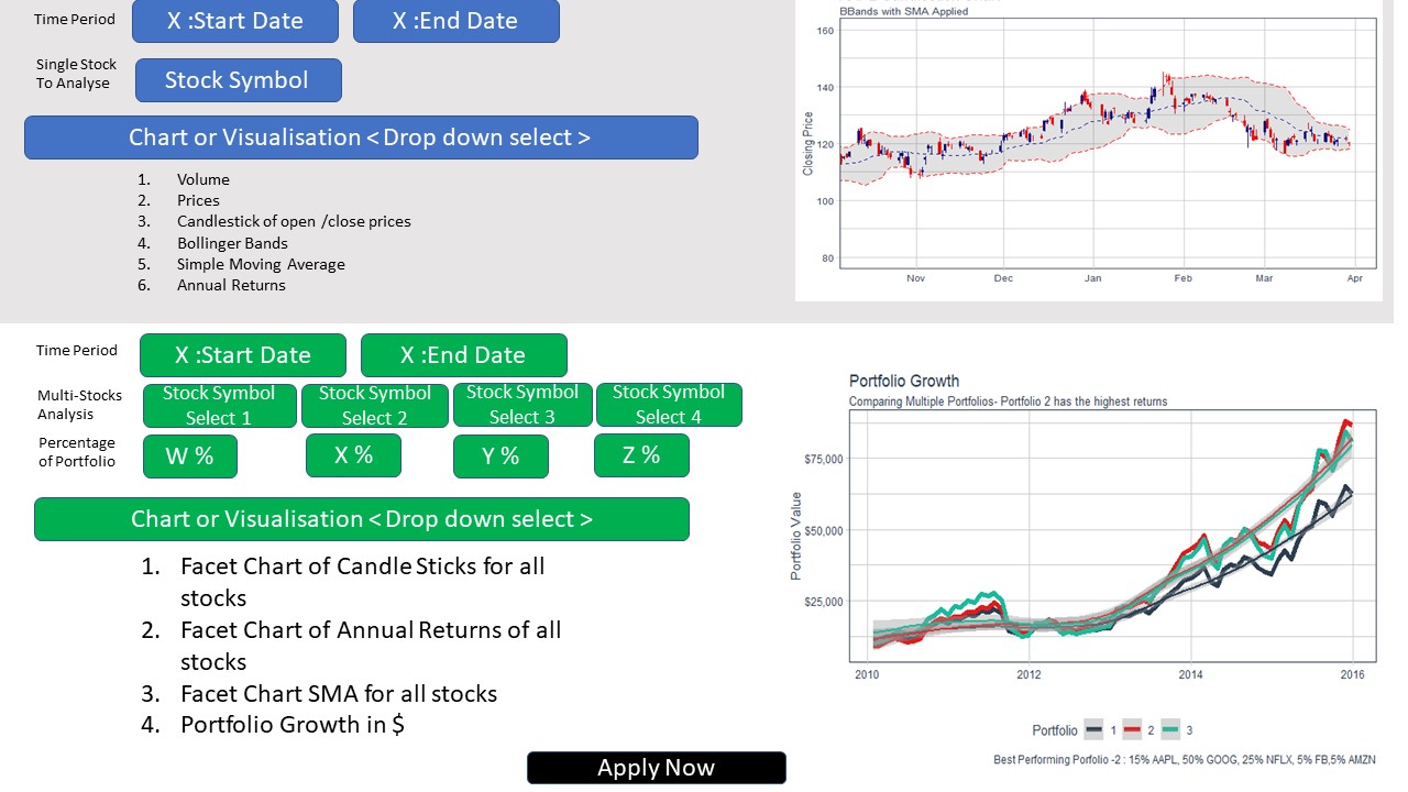
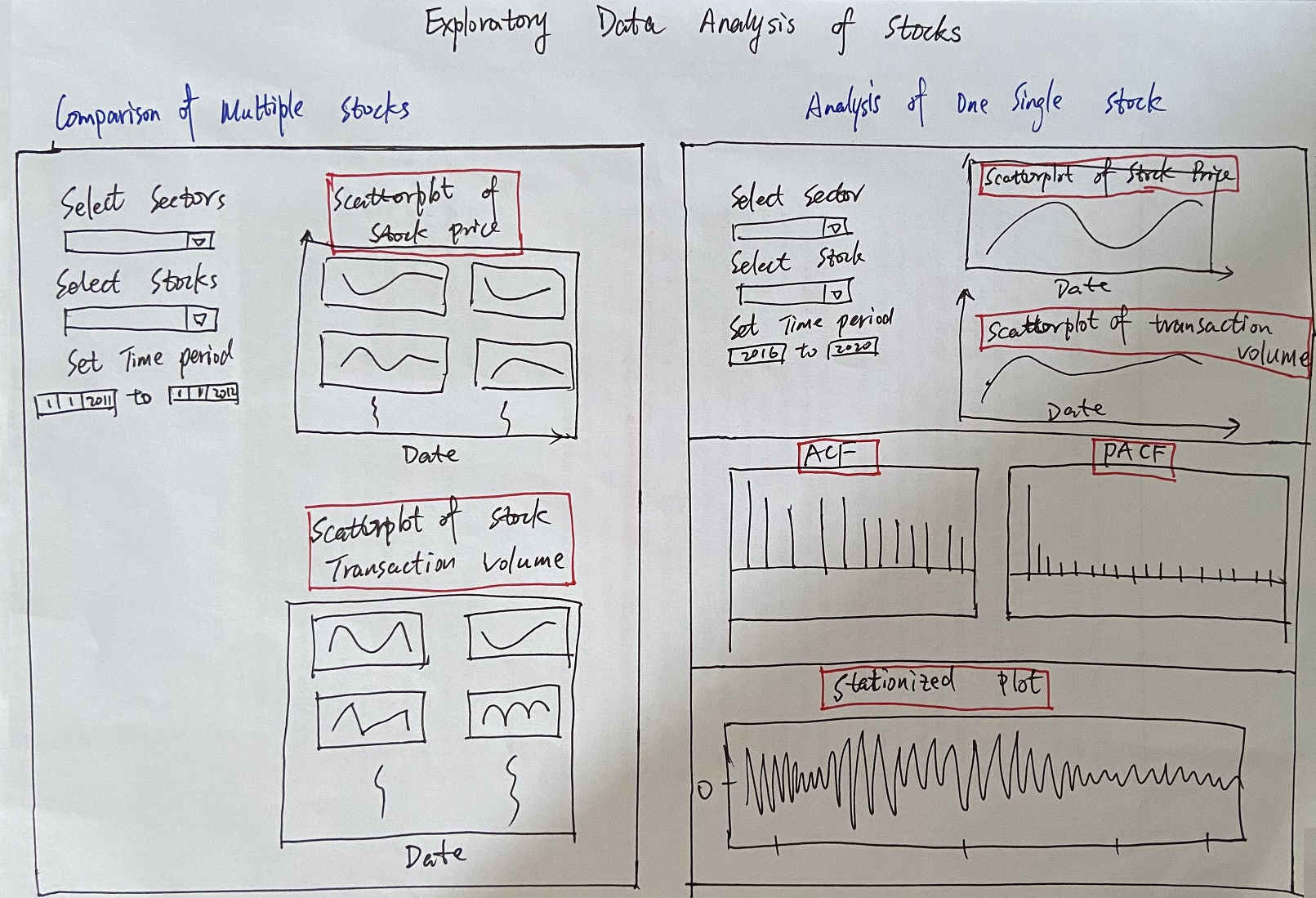
Notable features:
- Stock selection: the application will allow the user select the stock they want to forecast from the dropdown list.
- Horizon selection: users will be able to define the forecasting horizon. It’s still to be decided whether the field will have some fixed values or will it be a free text field.
- Differencing: a checkbox to configure whether the stock data should go through differencing before being trained and forecasted.
- Model selection and Dynamic UI: depending on which model is selected in the Model field, the Dynamic UI section will display the configurable parameters of the selected model. This will enable users to fine tune their models to get the desired result. Once the parameters have been set, clicking on the retrain model will re-fit all the models and update the line charts on the right.
- Train & Forecast: the chart for training and the chart for forecast will be on 2 different sub-tabs. This will preserve the screen real-estate while allowing users to quickly swap back and forth between training and forecasting.
Reference
- Hyndman, R.J., & Athanasopoulos, G. (2021) Forecasting: principles and practice, 3rd edition, OTexts: Melbourne, Australia. OTexts.com/fpp3. Accessed on April 7th 2021.
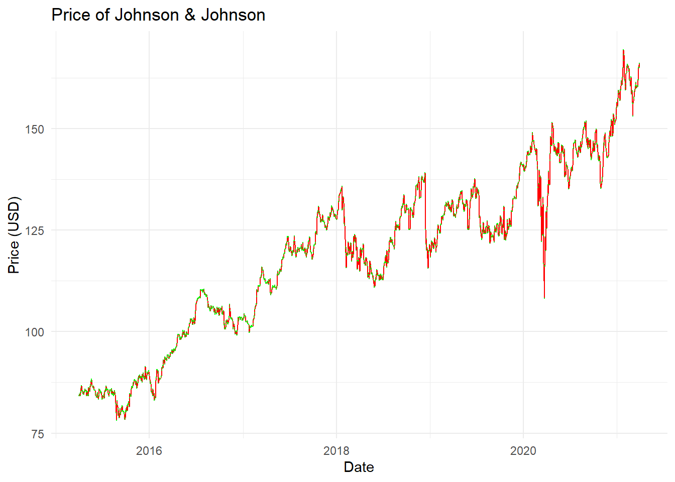

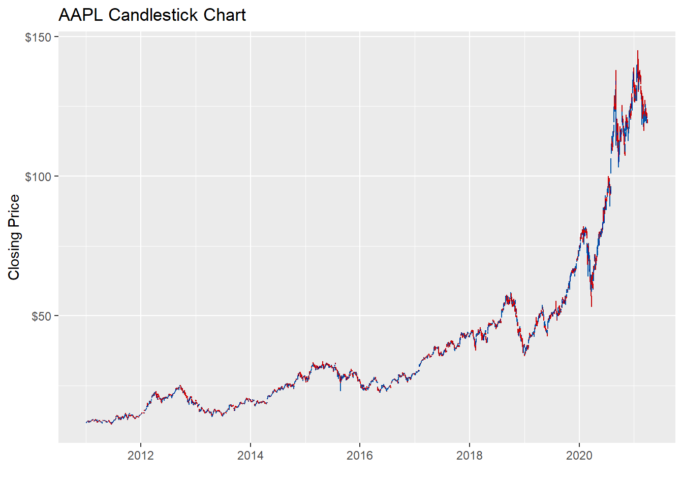

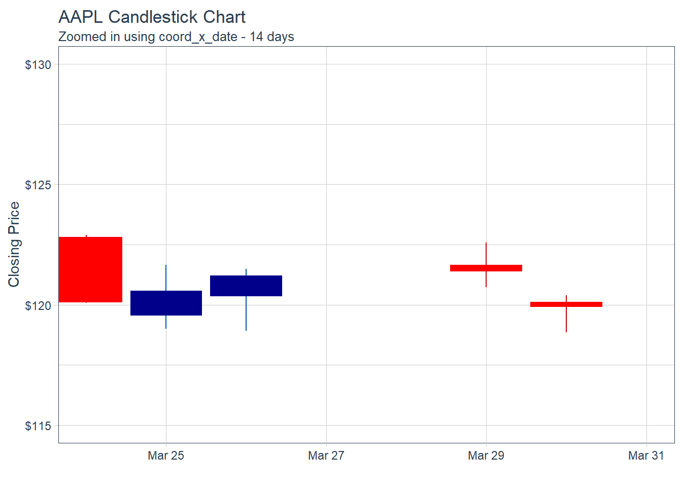
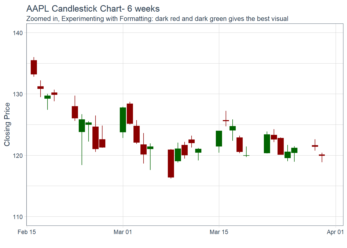
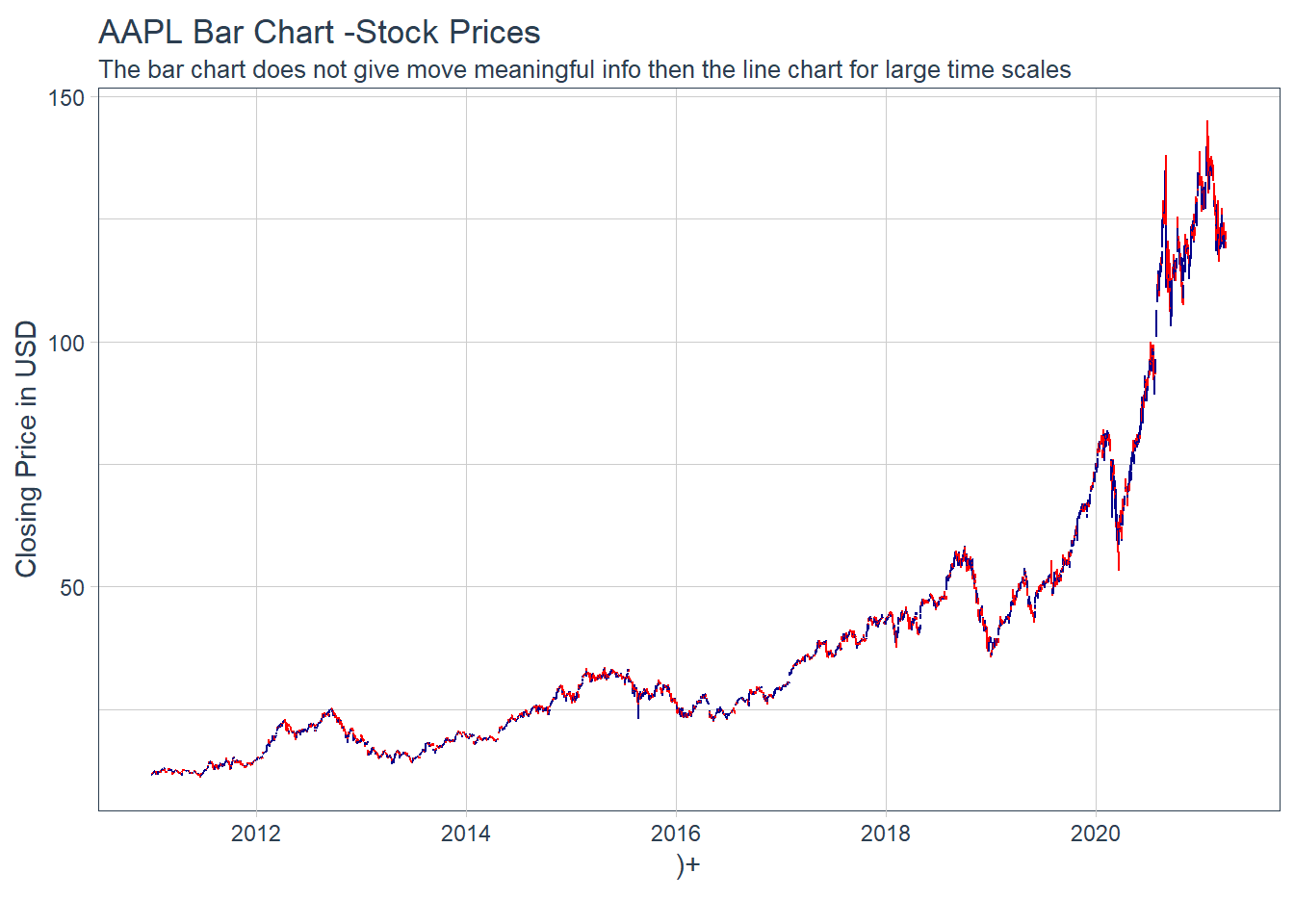
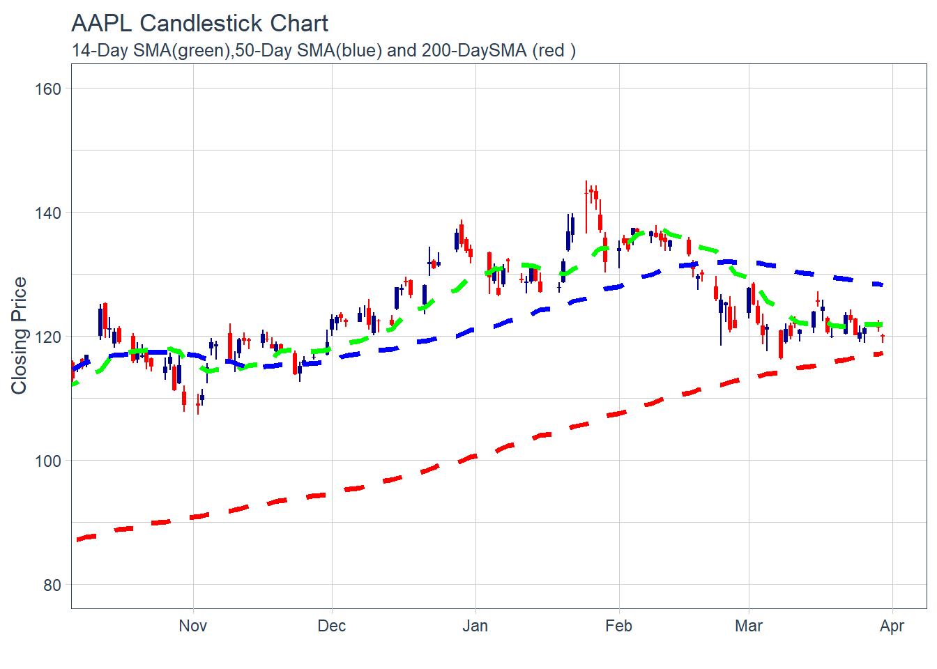
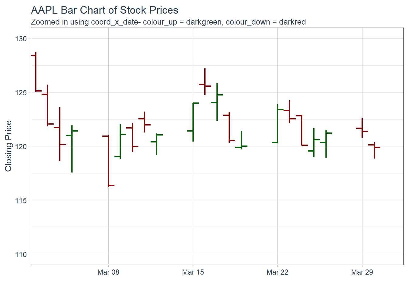 Key Learning :Candle Charts far easier to interpret than Pricebarcharts and much easier to read.
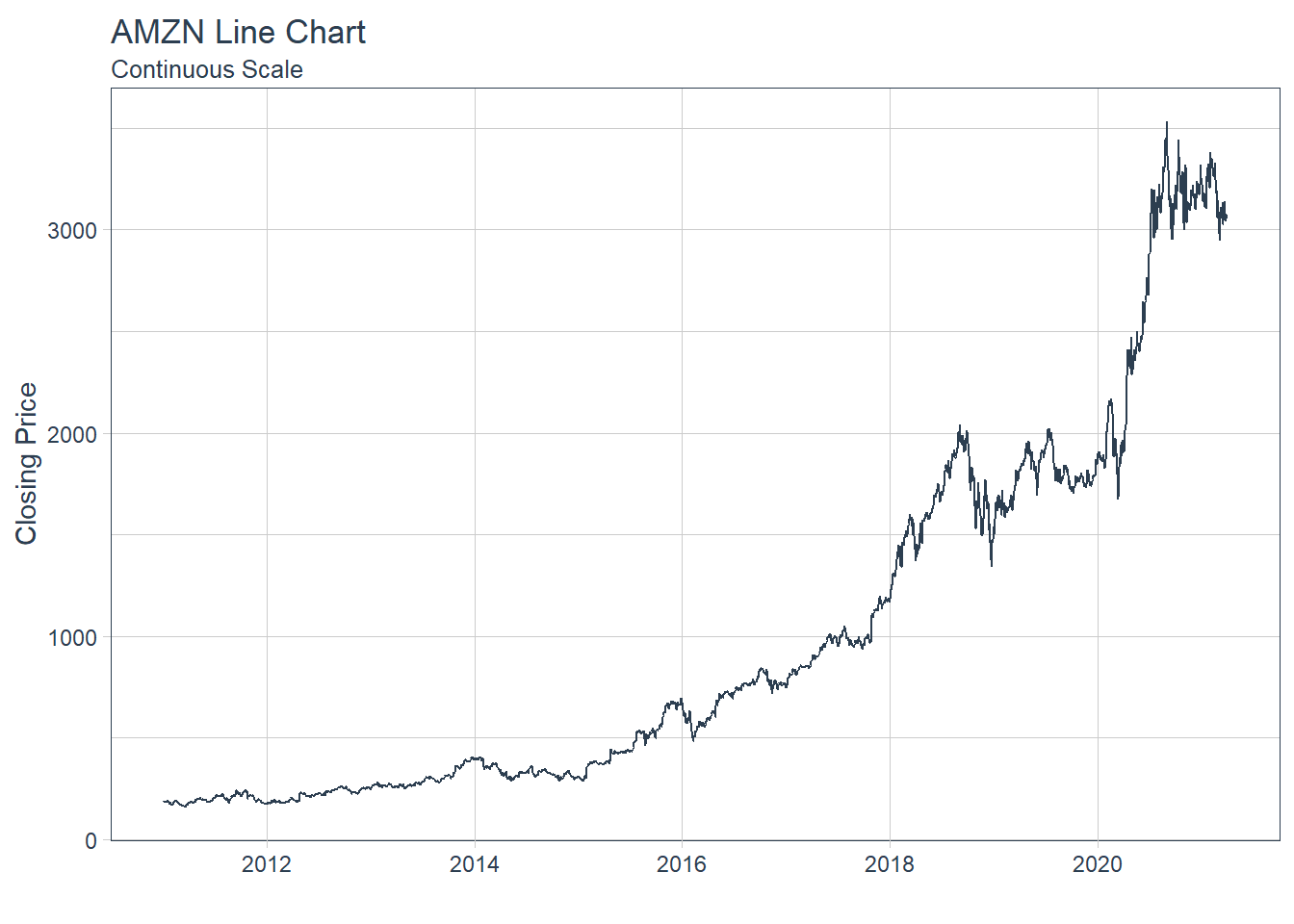
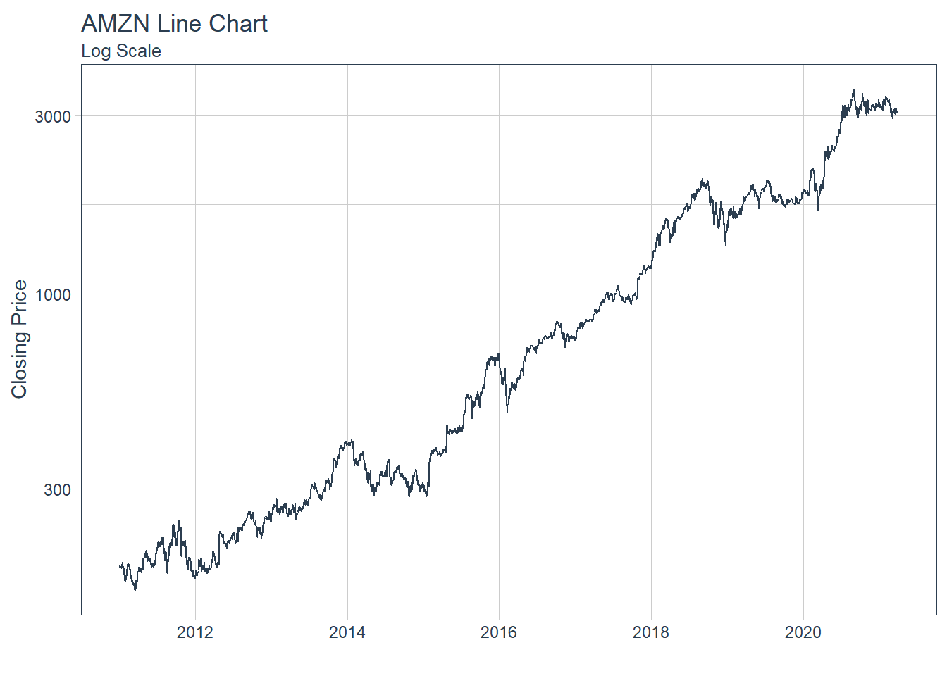
 #### 5.2.4 Single Stock Returns Chart - Line Chart/Time series.
 ##### 5.2.5.2 Charting Exponential Moving Average (EMA)
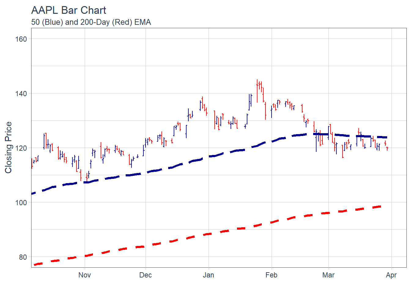
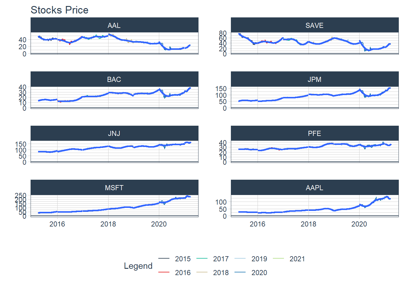
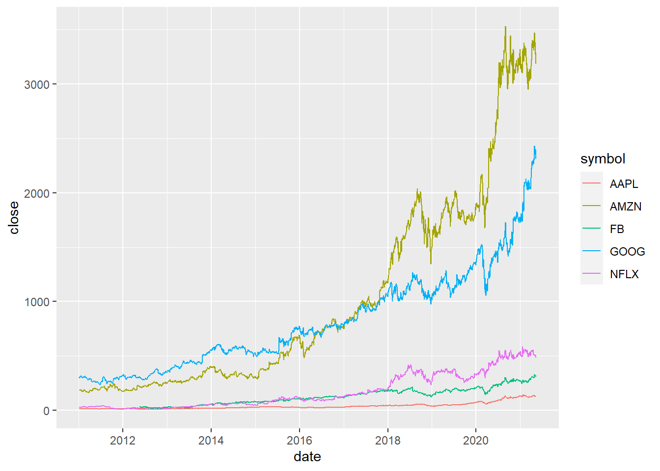 #### 6.1.2 Multiple securities - closing prices - in Facet
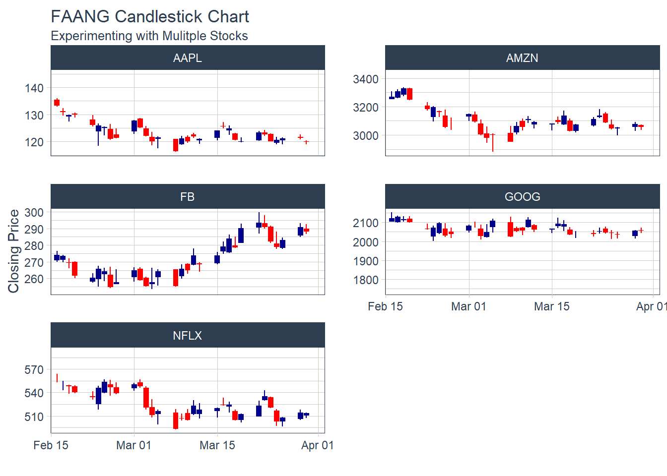
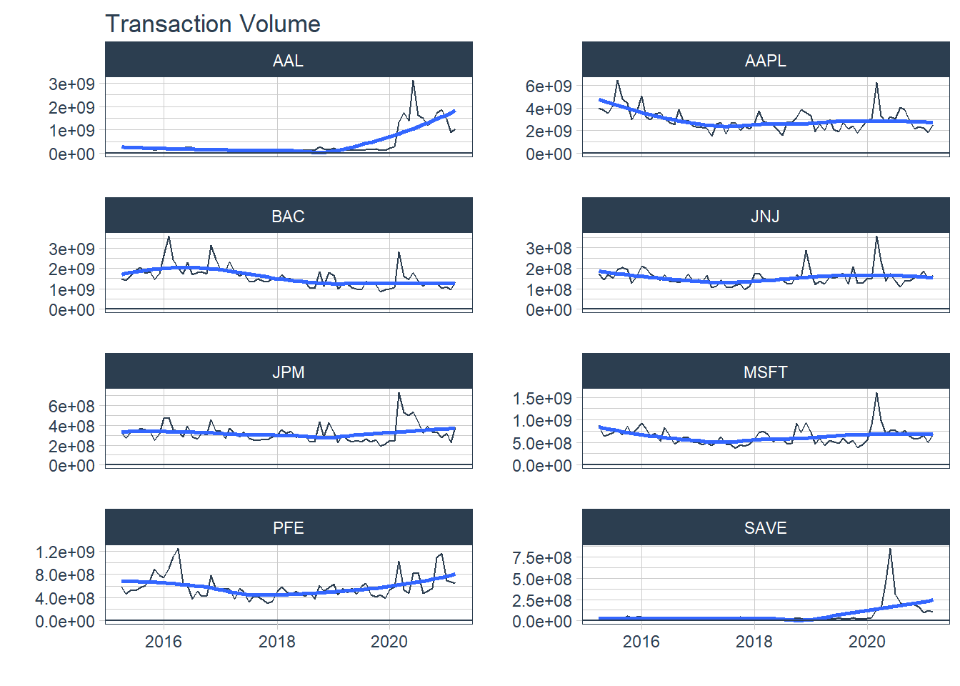
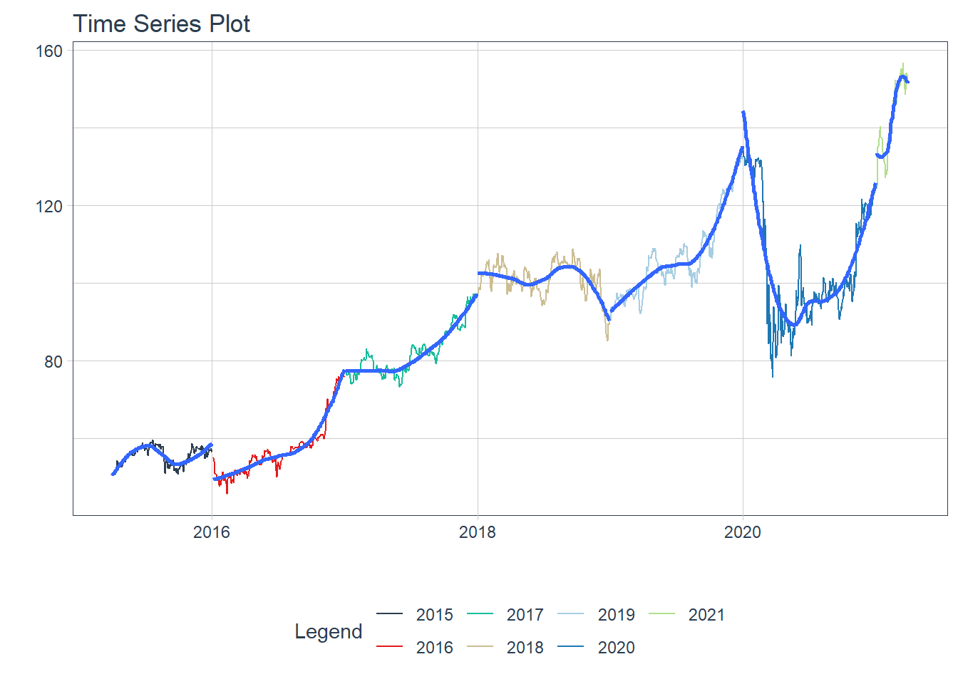
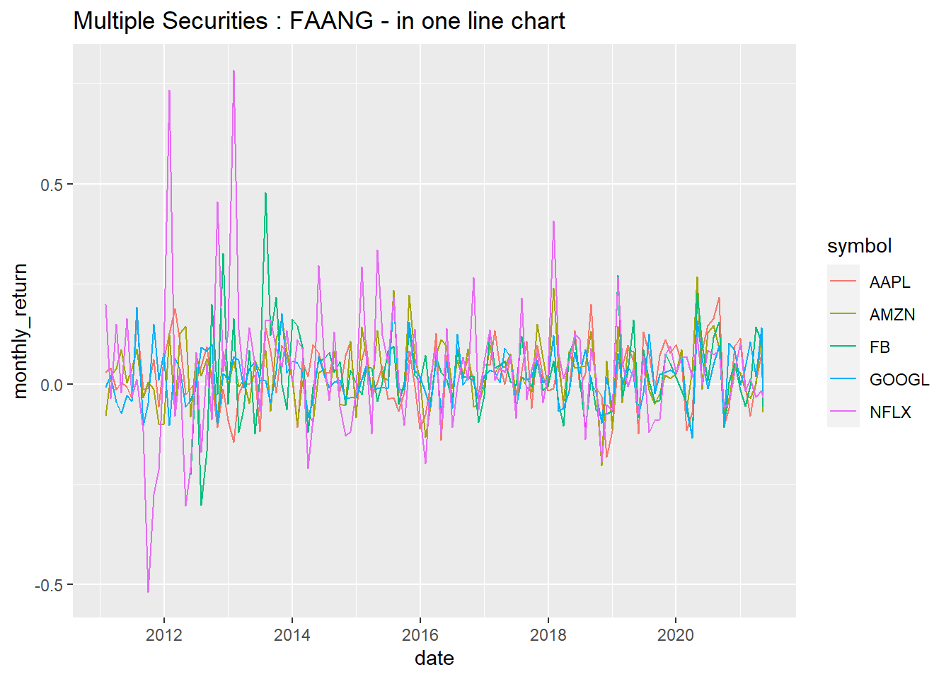
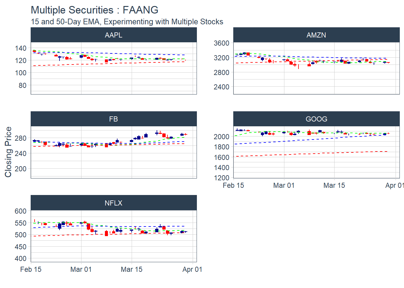 KEY LEARNING : It doesn’t make sense to plot multiple moving average days in one combined visual.. as the lines are too close to visualize.
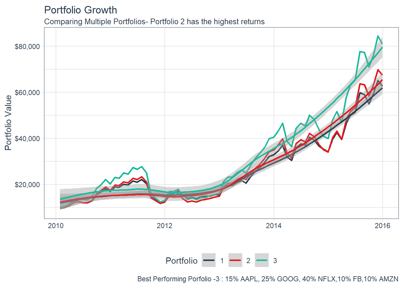
 ### 6.5 Portfolio Analysis using tq_portfolio function.
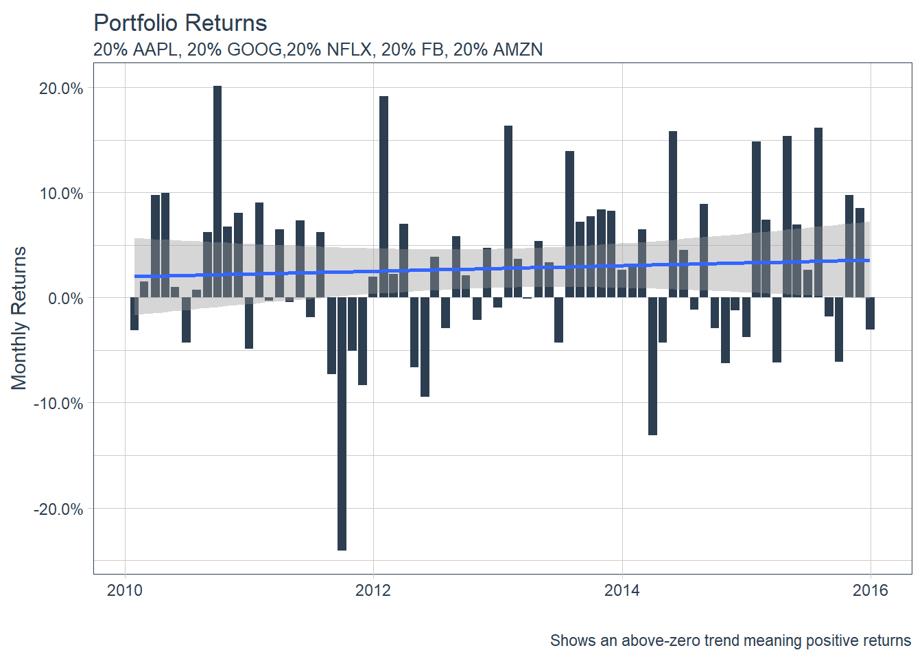
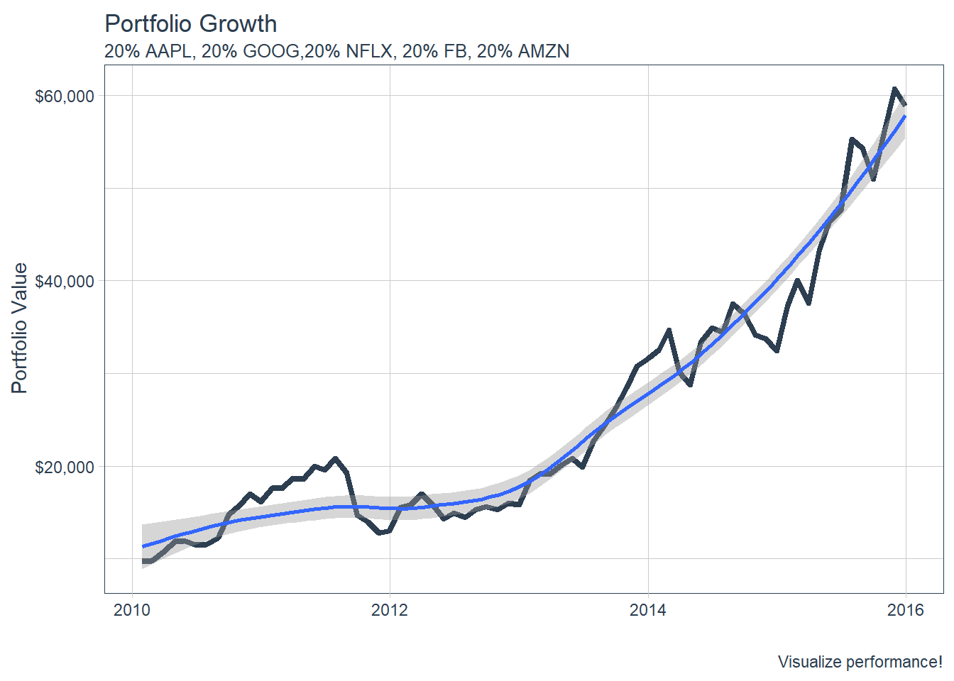
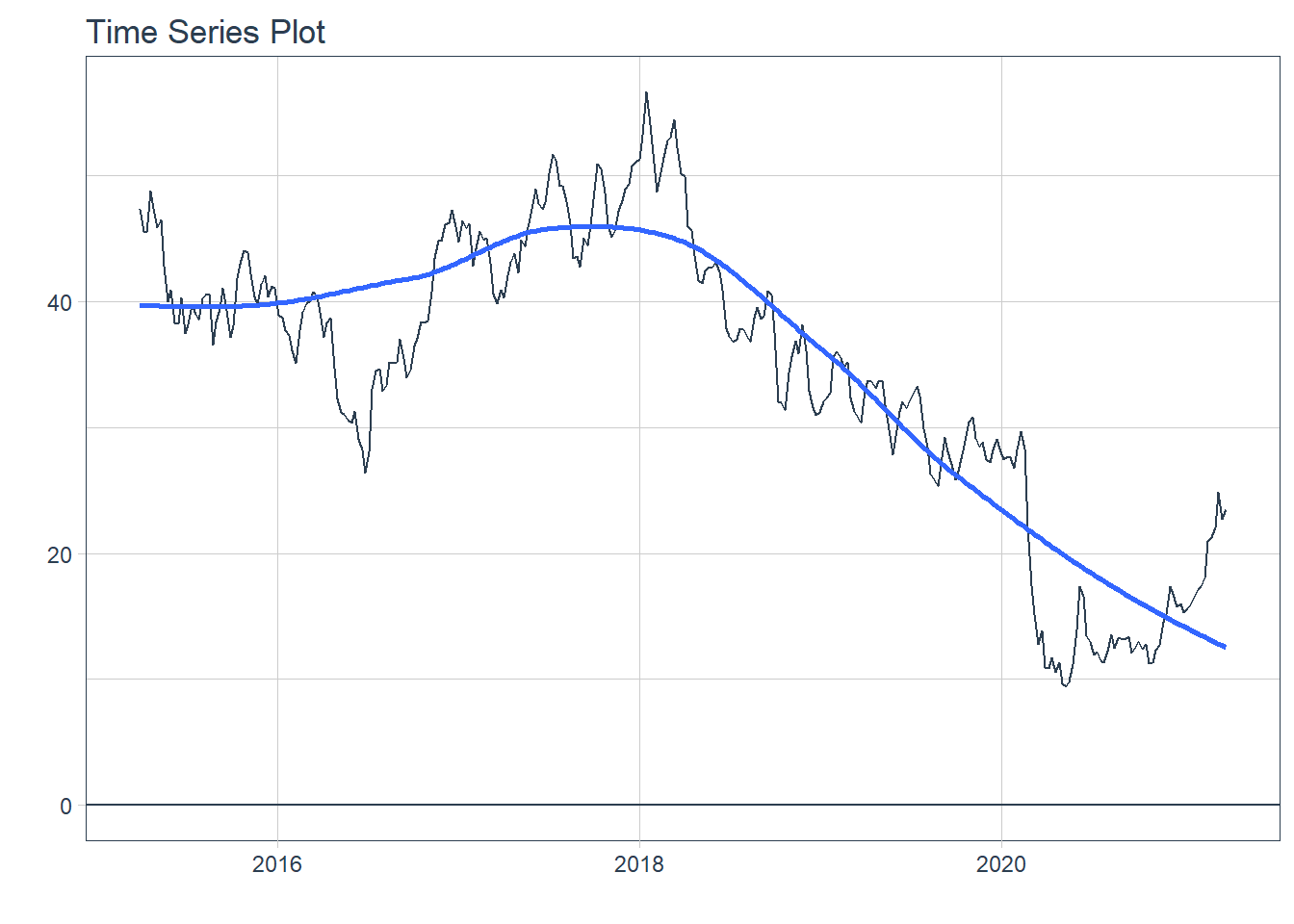
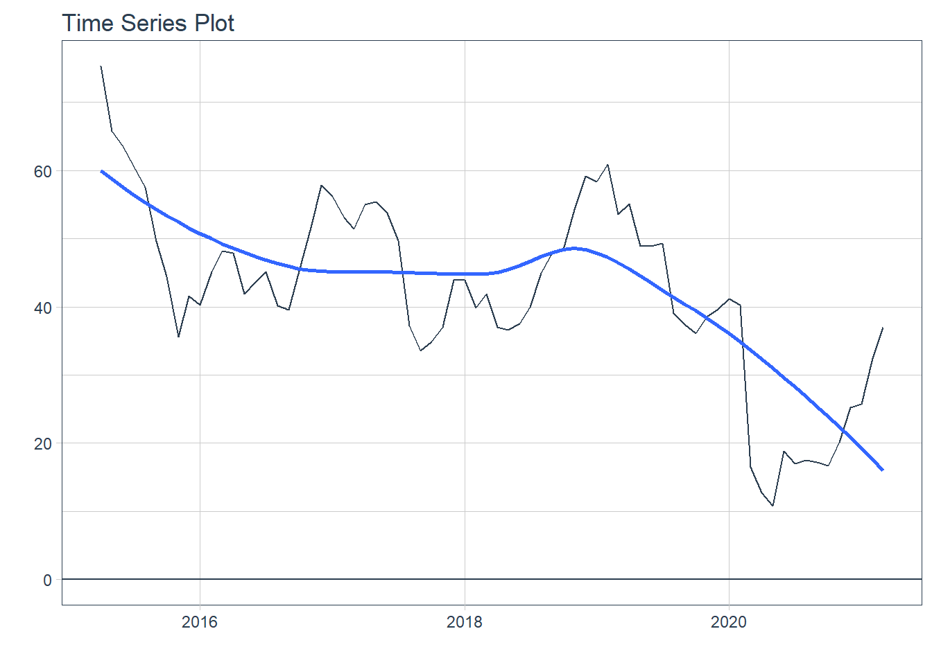
 ### 6.6.2 GGPLOT - Plotting Regression trendlines with geom_smooth
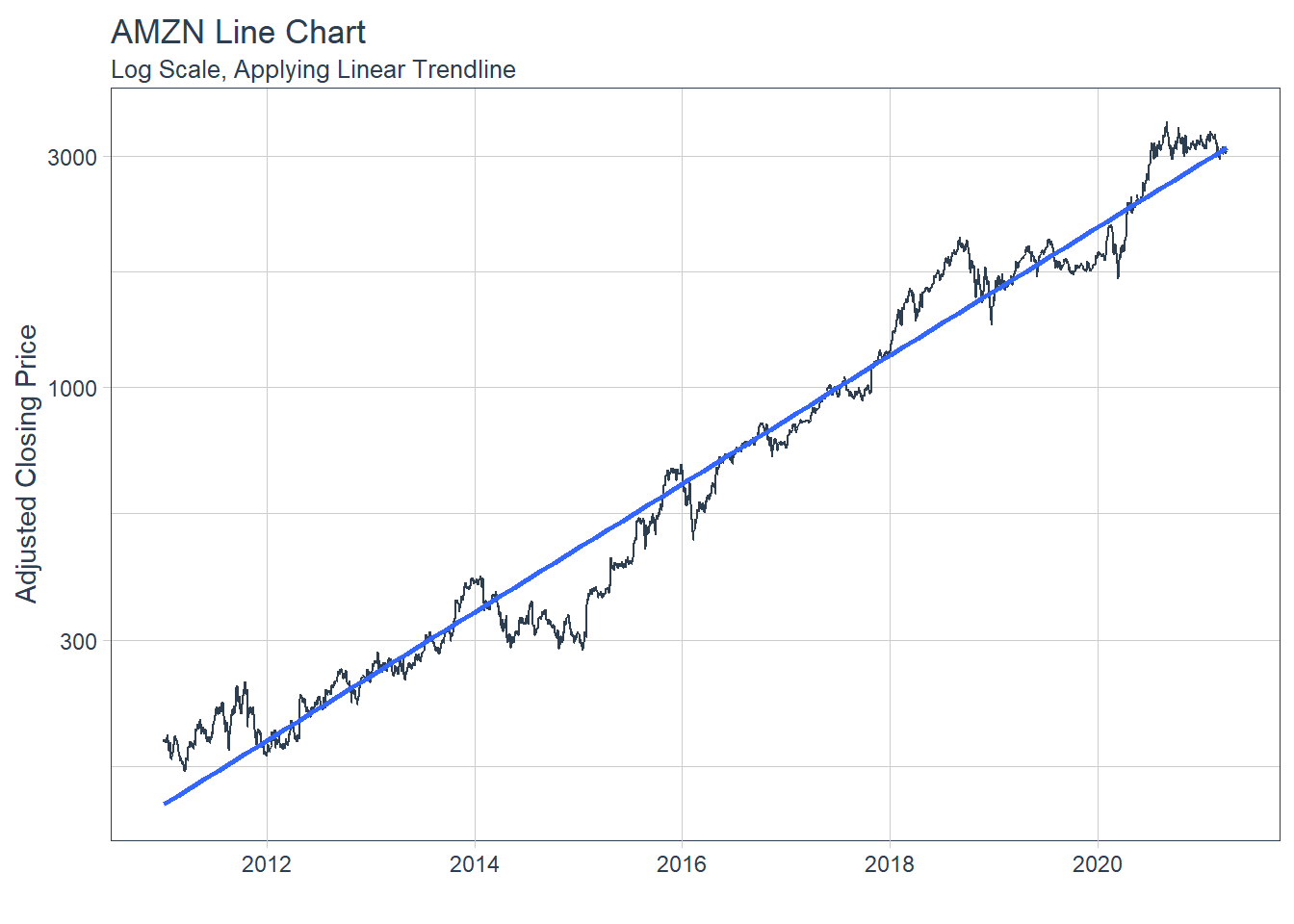 #### 6.6.3 Tidyquant Themes
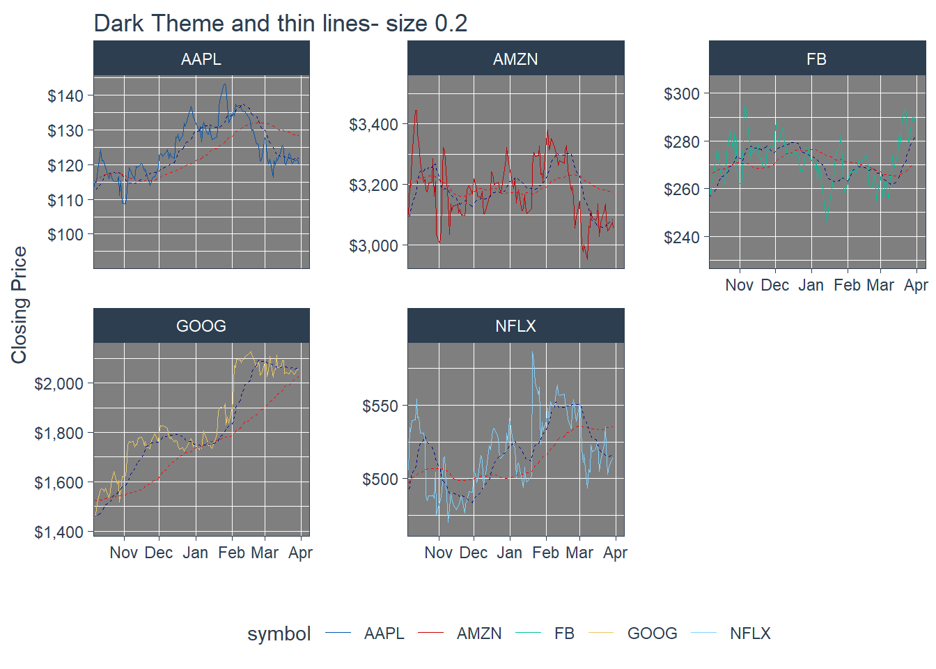
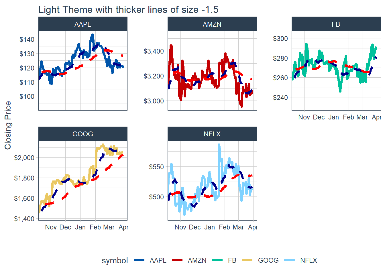
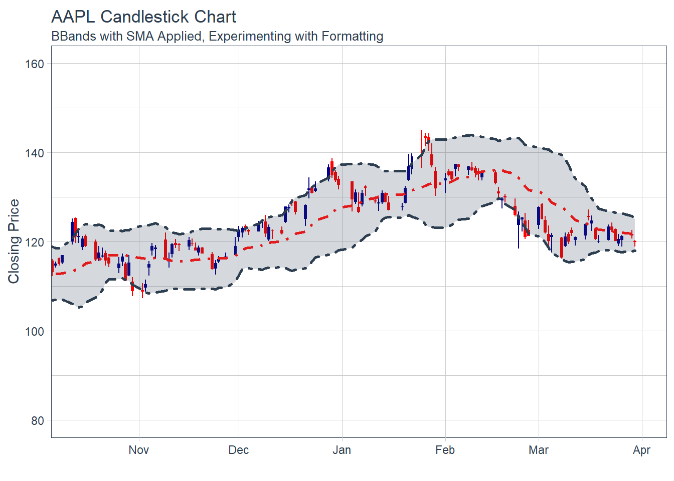
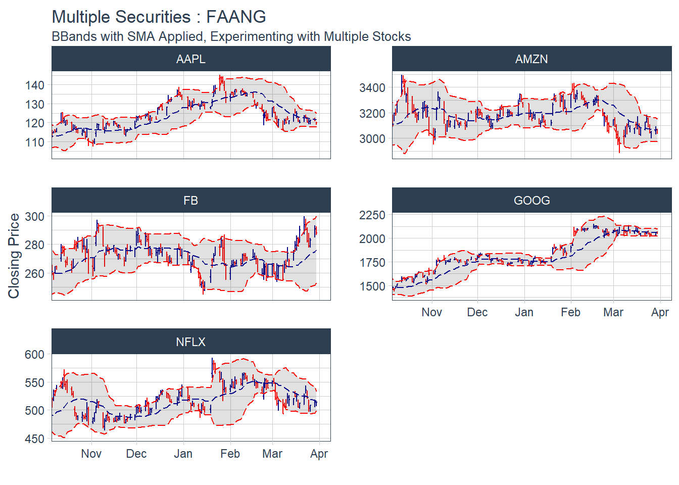
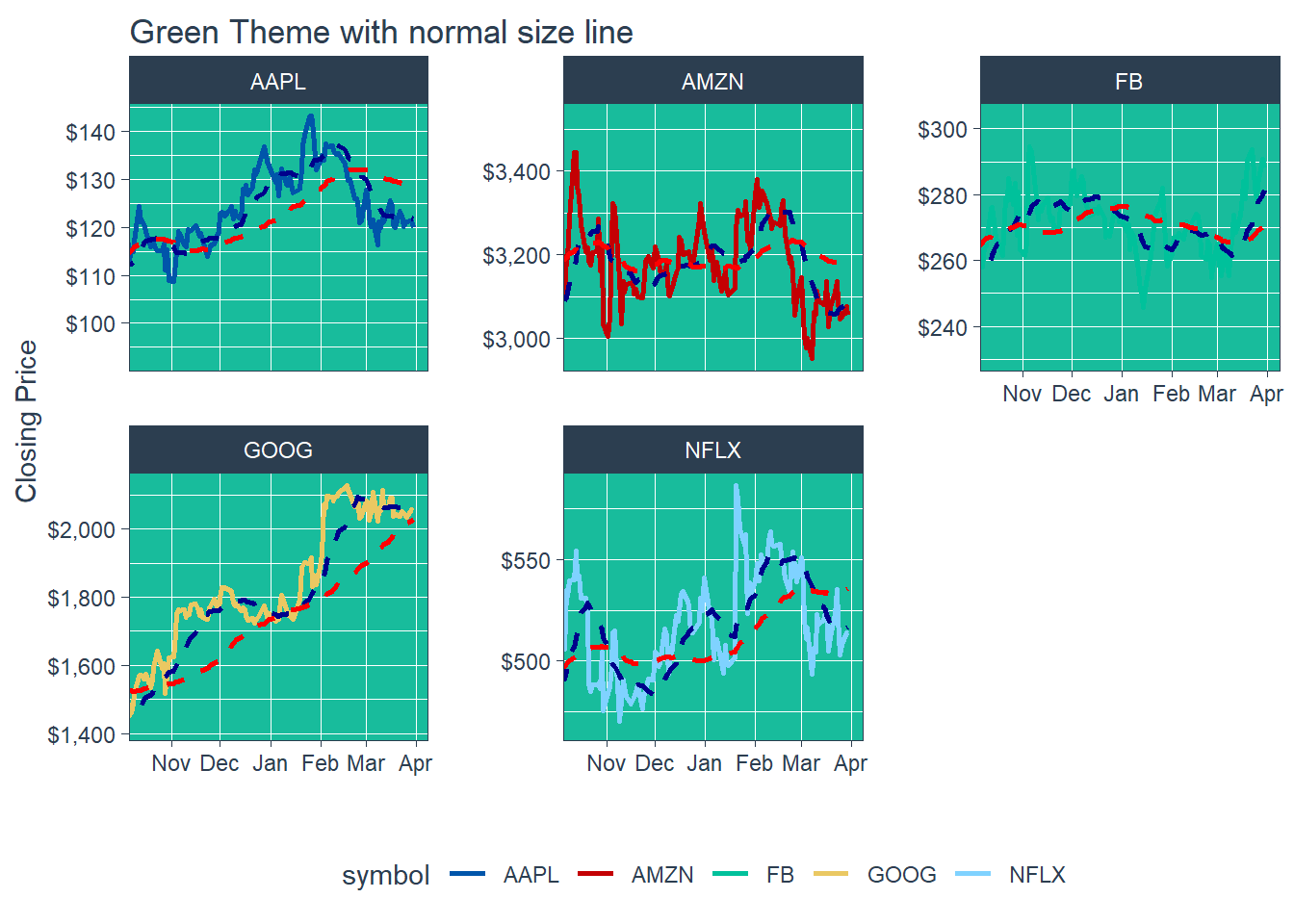 Key Learning : THe other colour schemes - will invariably collide with one of the coloured lines - eg. in the last example above. The white theme with normal size line of 1 is good for single charts, and for faceted charts, white background with a fine line width of about 0.8 : still presents the information with better clarity, and should be used for overall approach.